
News


When it comes to selecting the right fabric for your curtains or upholstery, the colour you choose can make a significant impact on the atmosphere of your home. With so many options, it can be challenging to know where to begin. By understanding how colours work together, the moods they create, and the basic principles of colour theory, you can simplify your decision-making process and end up with a fabric selection that enhances the look and feel of your space.
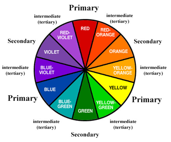
Let’s start with the basics. The primary colours—red, blue, and yellow—are the foundation of all other colours. All other colours you see in fabrics, whether vibrant or muted, are derived from some combination of these three.
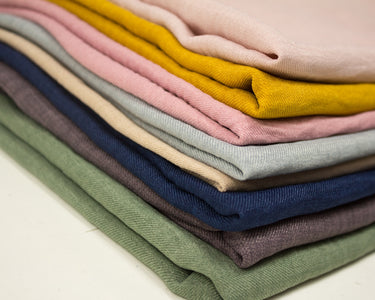
While you may not want to use pure, bright versions of these colours for curtains or upholstery, you can choose their more subdued variations. For instance, maroon (a darker, richer red), navy (a deeper blue), or gold (a yellowish tone) can add depth and elegance to your interior while still staying true to the primary palette.
Take a look at some of our solid coloured plain fabric in the Panton Linen Curtain Fabric range and the Dion Cotton range.
Secondary colours are created by mixing two primary colours together. These colours lie between the primary colours on the colour wheel:
When selecting fabrics for your curtains or upholstery, think about how these secondary colours can work in harmony with the other hues in your space. For example, an earthy green upholstery fabric can be a beautiful complement to wooden furniture or a nature-inspired décor theme.
Intermediate colours, also known as tertiary colours, are created by mixing a primary colour with a secondary colour. This results in six unique shades:
These colours bring even more versatility to your fabric choices, offering shades that range from muted to vibrant, providing a range of moods for your home.
Neutrals (black, white, grey, and every variation in between) are colours that are not part of the colour wheel. They are incredibly versatile and can complement virtually any other colour. A neutral fabric for your upholstery or curtains can balance a room that’s otherwise filled with more vibrant colours. Neutrals create a calming effect and are great choices for spaces where you want a more subdued or minimalist look.
Now that you have a better understanding of colour basics, let’s talk about how to mix and match colours for your fabric decisions. This is where the fun of colour theory comes in, and understanding complementary, analogous, monochromatic, and triad colour schemes can help you make decisions that work together in harmony.
Complementary colours are those that lie opposite each other on the colour wheel. When paired together, they create striking contrast and make each colour appear more vivid.
For instance, yellow and violet or orange and blue are complementary pairs. Using complementary colours in your fabric choices can make your curtains or upholstery pop, adding excitement to your room while keeping things balanced.
Analogous colours are located next to each other on the colour wheel. These colours have a shared hue, making them easy to mix without clashing. For example, a combination of blue, blue-green, and green can create a serene, cohesive look.
If you prefer a softer, more harmonious approach, using analogous colours in your fabrics will help bring a sense of continuity and flow to your room’s design.
Monochromatic colours are variations of the same hue, but in different shades, tones, or tints. For instance, a range of purples from deep violet to light lavender creates a monochromatic palette.
Using different shades of a single colour in your fabric choices will create a sophisticated, unified look in your space, giving your room depth while maintaining a cohesive feel.
A triad colour scheme involves three colours that are evenly spaced around the colour wheel. This combination can create a vibrant, balanced look, perfect for more playful or dynamic spaces. For example, primary colours—red, blue, and yellow—form a triad. By mixing fabrics in these colours, you can create a balanced yet bold aesthetic.
Colours can be classified as warm or cool, and understanding this distinction can help you create the right atmosphere in your room.
If you’re looking to make your room feel cosy and welcoming, a warm colour palette will do the trick. On the other hand, if you want to create a serene, open feel, cool colours are the way to go.
The beauty of colour lies in its flexibility, and you don’t need to choose between warm or cool colours exclusively. In fact, mixing both warm and cool colours can add complexity and balance to your room.
For instance, if your space has a predominantly warm colour scheme with rich reds and oranges, adding a touch of blue or green (cool colours) can provide contrast and visual interest. Similarly, a cool room with blue and violet tones may feel more inviting with the addition of a warm accent, like a deep red or golden fabric.
Choosing the right fabric colour for curtains or upholstery can feel overwhelming, but by understanding the basics of colour theory and how colours interact, you can make more confident decisions. Whether you’re working with primary, secondary, or neutral colours, the key is balance—experiment with complementary, analogous, or monochromatic palettes to create a cohesive and inviting atmosphere.
By mixing warm and cool tones thoughtfully, you can craft a space that feels just right for you, no matter your personal style. So take the plunge and have fun with your fabric colour choices—it’s all about creating a space that feels like home.
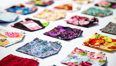
Take a look at our colourful range of fabrics here:
For more information about colour psychology check out Saint and Poets Blog on Exploring the impact of colour psychology in your home.


